OHZONE Rebrand & Digital Strategy
OVERVIEW
OHZONE Inc. transforms real garments into high-fidelity 3D models for
e-commerce, marketing, and AR/VR experiences.
The goal of this particular project was to establish a clear brand identity and visual framework to communicate the power of the technology, align the founding team around product vision, and attract early clients and investors.
ROLE
Design & Strategy Consultant
Brand Identity, Website Design, Product Roadmap Visualization, Customer Research, Visual design, Marketing & Investor Materials
March 2019-Feb 2020
MY APPROACH
I conducted strategy assessments and team interviews, translating insights into Lean Canvas frameworks and guided brainstorming sessions that aligned the team on solutions, customer segments, and early adopters. I also designed and delivered a new logo, website prototypes in Adobe XD, managed contractors, and oversaw the adoption of new tools, including Figma, RelayThat, and HubSpot. In addition, I led the naming process to name the technology 3DREAL and developed supporting materials for sales, investor outreach, and social media
DESIGN STRATEGY
This phase focused on framing the problem and defining opportunities before visual design began. Acting as a UX and product strategist, I worked to connect OHZONE’s technology capabilities with user needs and market positioning.
Through journey mapping, stakeholder workshops, and customer interviews, we identified critical friction points and clarified what value the experience needed to deliver. These insights informed product priorities, guided feature hierarchy, and established the foundation for the brand system that followed.
The process bridged UX, product, and business strategy, ensuring that every design decision served both user goals and company vision.

Above: Human-centered discovery work—stakeholder interviews, strategy workshops, and a Business Model Canvas used to clarify assumptions, define audiences, and guide early product focus.
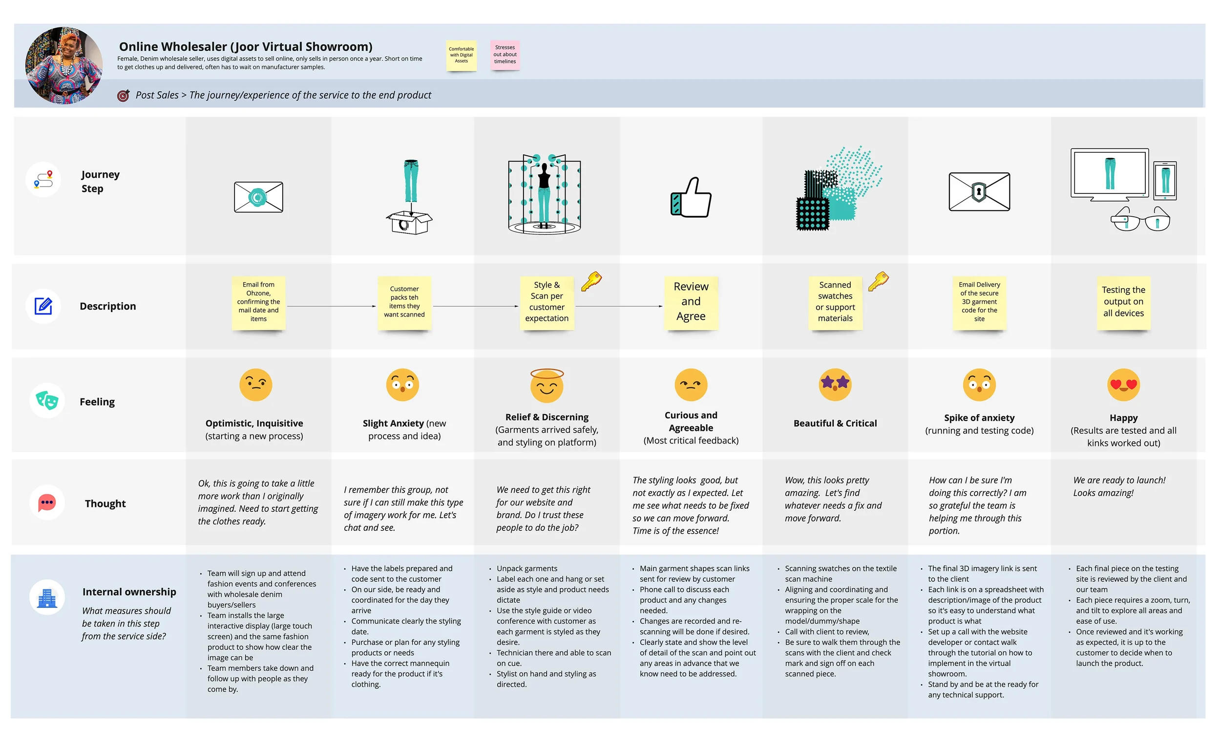
Above: End-to-end user journey mapping, visual language design, and alignment sessions to prepare the company for future customer onboarding.
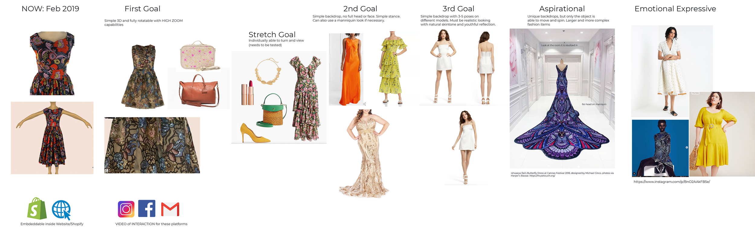
VISUAL TECHNOLOGY ROADMAP
After doing the research and meeting with the team, my first step was to create a shared visual language that clarified where the technology was and where it could go. Early imagery focused too heavily on the mannequin, distracting from the true strength of the product—its ability to capture fabric and texture with lifelike precision.
Our goal was to shift focus to the garments themselves, then reintroduce people later in a more refined, editorial way for showroom and fit contexts. By 2020, the OHZONE team had achieved that vision, bringing garments to life on digital avatars for runway shows, showcases, and AR/VR experiences.
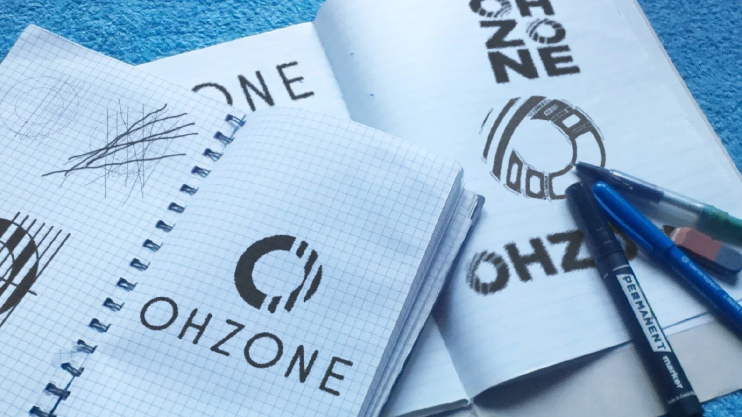
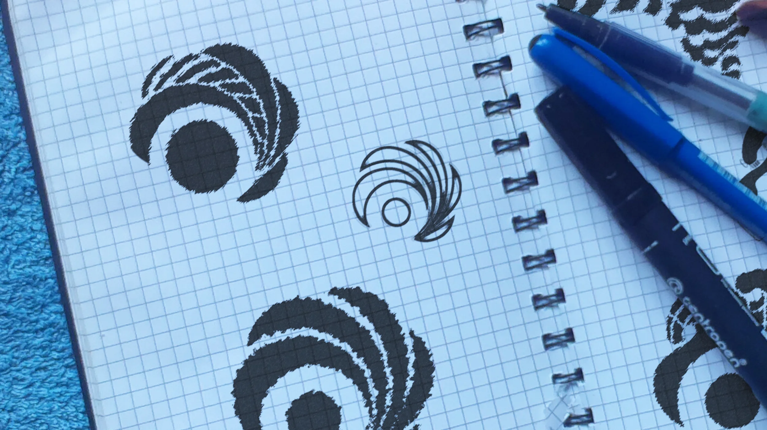
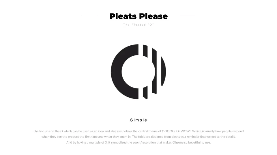
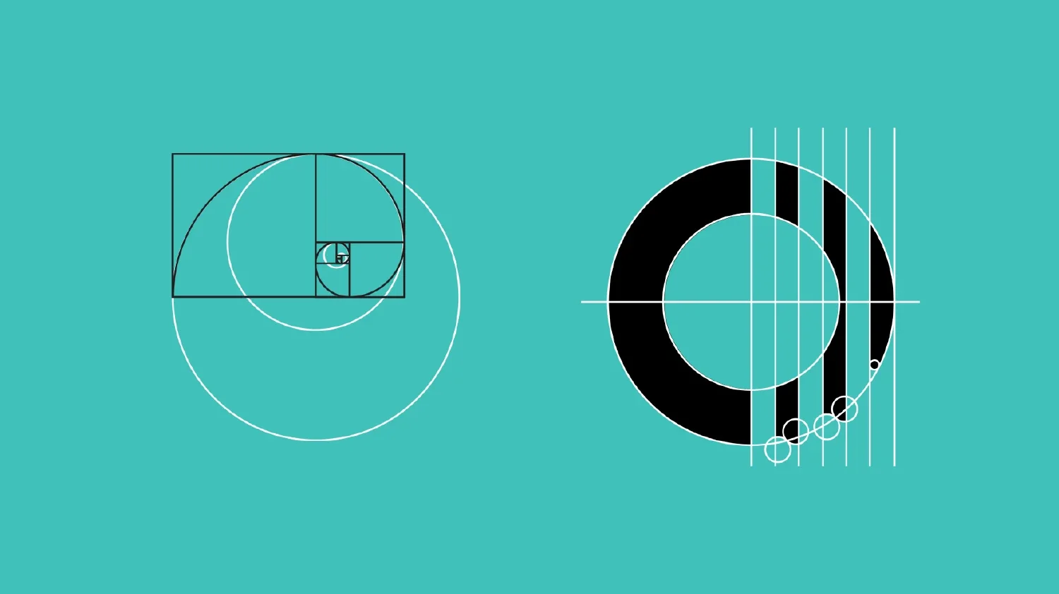
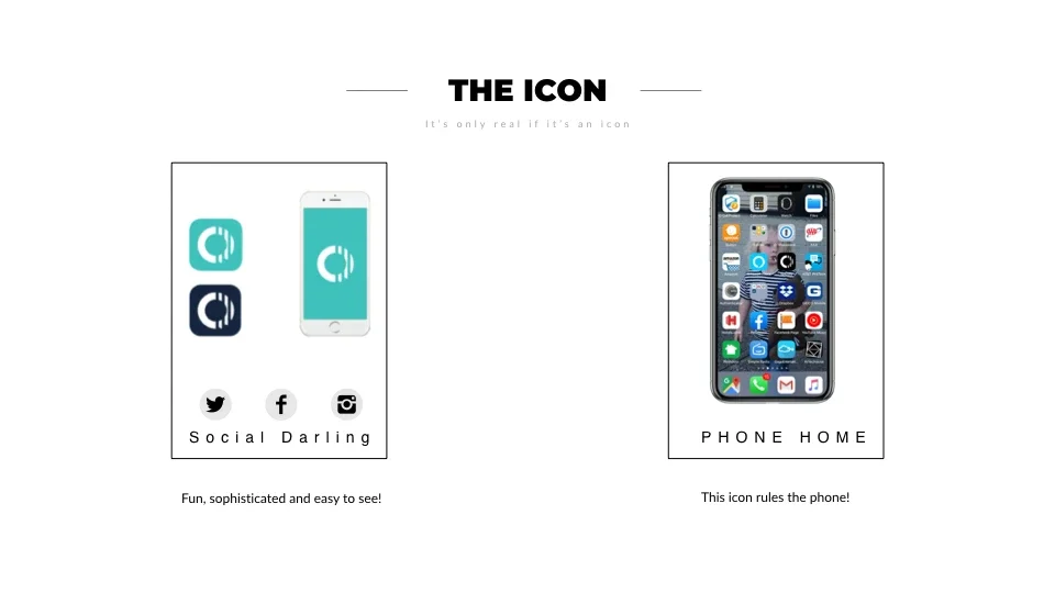
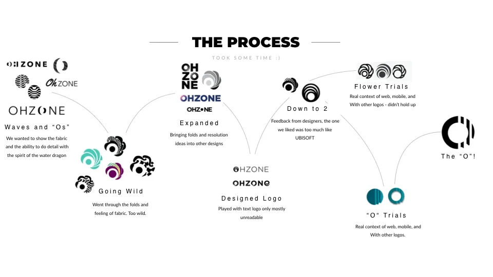
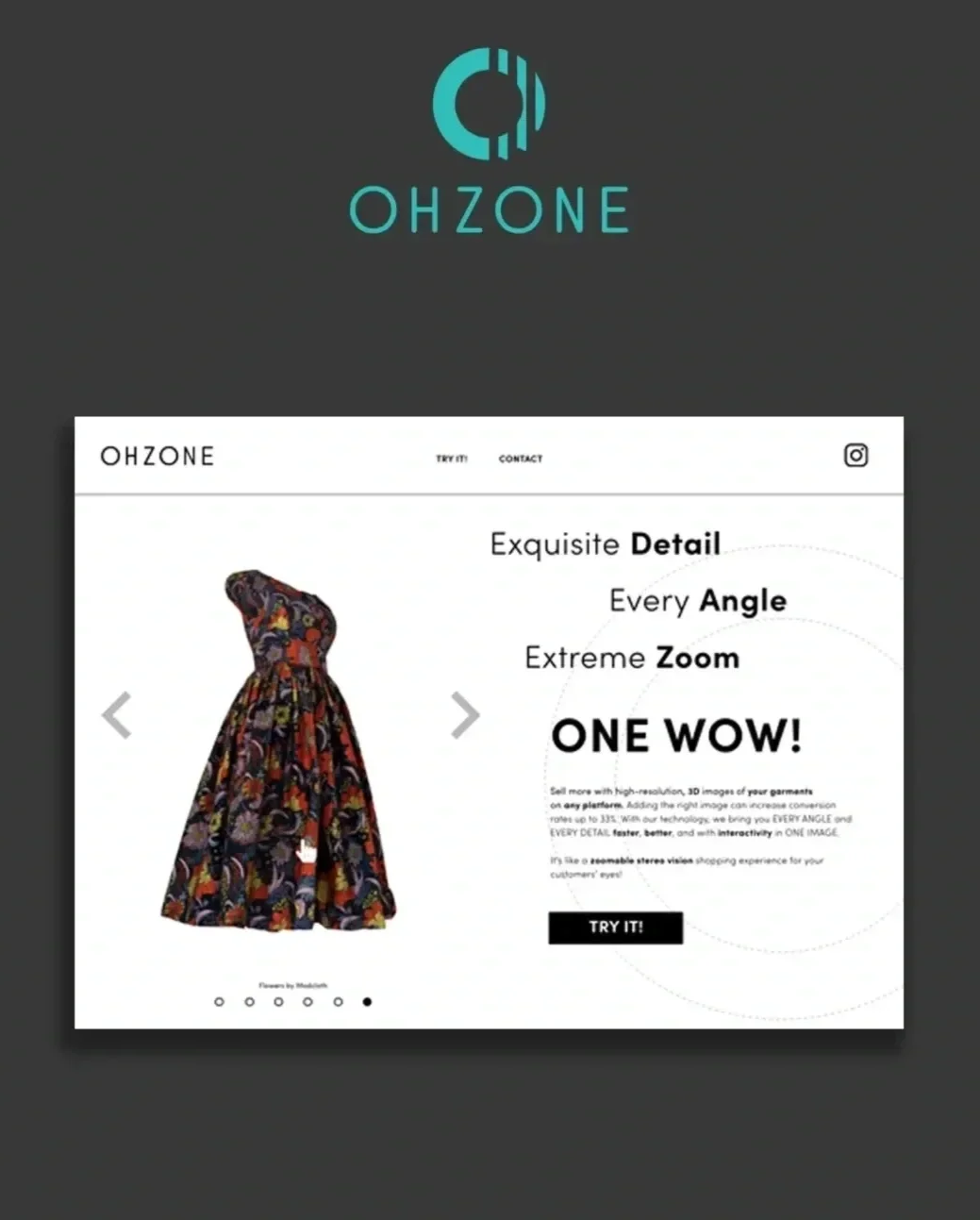
LOGO REDESIGN
The logo works in both B&W and with a smart aquamarine color scheme for a modern feel. Below you can see the LOGO process gallery. I was the Creative Director, and I worked with Behance Artist: IGOR EGOROV
Creative direction centered on capturing the “wow” moment users feel when first encountering the product—and again as they zoom in to explore its depth and realism. The folded forms draw inspiration from pleats, emphasizing texture and material accuracy. A repetition of three represents the product’s core visual principles: zoom, resolution, and angle. Typography was set in a light, rounded sans-serif to maintain a clean, modern, and tactile aesthetic aligned with OHZONE’s visual identity.


BEFORE
On the left is the logo and main website of Ohzone Inc with a stiff manniquin and logo trying to do too much illustratively for the complexity of the company.
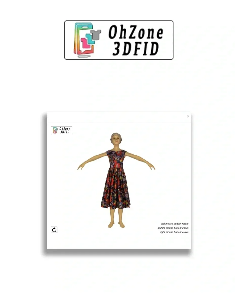
AFTER
On the right is the new brand design and approach, including a new logo, feature visualization, tone, and UX for the website.
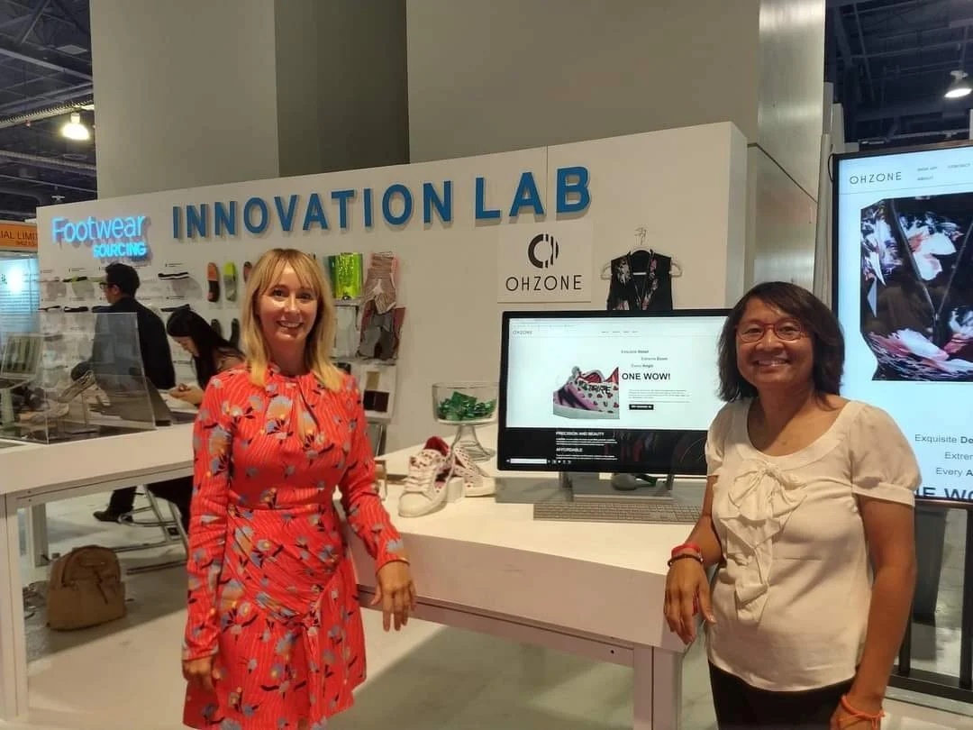
SALES AND EVENTS
Right: On-site with the brilliant founder (Oh Tepmongkol ) during an early launch event. I supported brand and event materials while gathering insights from attendees and potential customers—firsthand research that informed early positioning and product strategy.