enCappture UX System Design
OVERVIEW
enCappture is a white-label mobile app platform that powers branded apps for over 500 organizations. The company needed a cohesive design system and unified brand experience to replace an inconsistent interface and scattered visual identity.
The goal of this particular project was to redesign the entire app ecosystem and brand collateral to create consistency across products, streamline the user experience, and align the visual language with the CEO’s vision for a scalable, premium platform.
ROLE
Head of Design
Brand Identity, Design System, App Redesign, Product UI/UX, Figma Implementation, Marketing & Event Materials, Sales & Investor Decks
March 2021-Present
MY APPROACH
My approach centered on connection and clarity—aligning brand, product, and leadership around a shared design vision. Partnering with the CEO and Product team, I rebuilt enCappture’s fragmented ecosystem into a unified, modular design system that scales elegantly across 500+ client apps and all marketing channels.
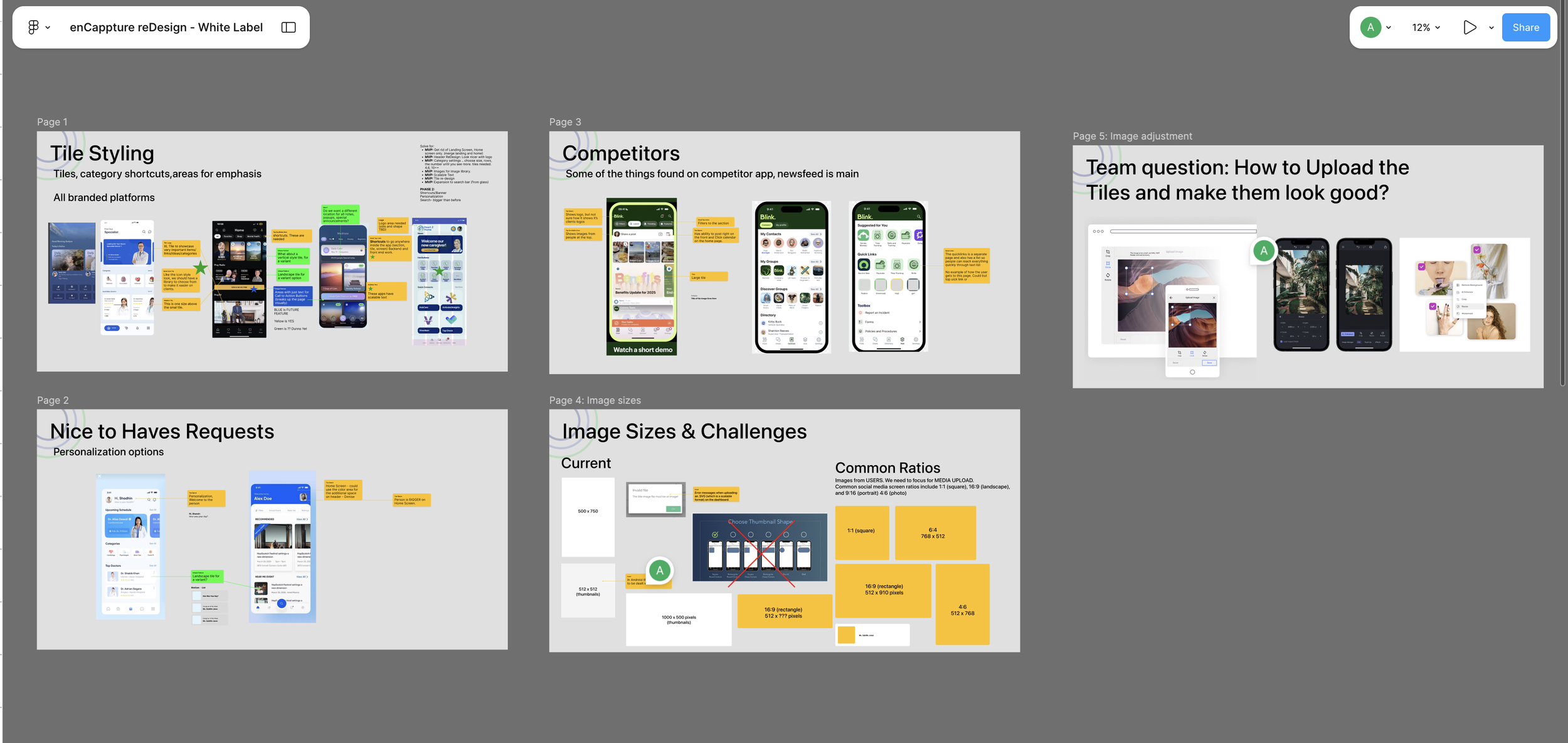
FAST ITERATION AND DESIGN SPRINTS
To meet the team's very tight timelines and requests. We would work directly in FIGMA and make adjustments. My job included responding quickly and setting up discussion and presentation formats that allowed us to make comments and get feedback in real time.
INCREMENTAL APP DESIGN
The app and the backend dashboard were in use, and it required working on the update incrementally starting with the onboarding and login.
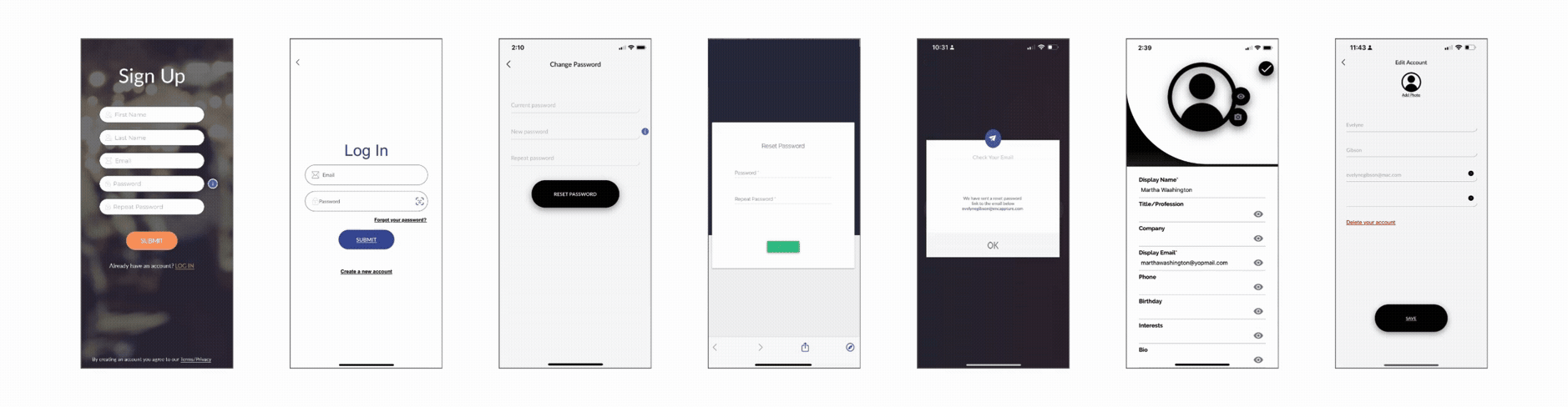
Above: Example of the login and UX flow of the signup and login experience. The initial design looked like different apps and had no common visual language. Even the text areas and forms were different from page to page. After the redesign, it became one simple, cohesive design. The revised version is a true white label and can be used by their 500+ clients, as well as new ones. The Header and buttons are all precoded to primary and secondary color scheme of whatever brand is using the app.
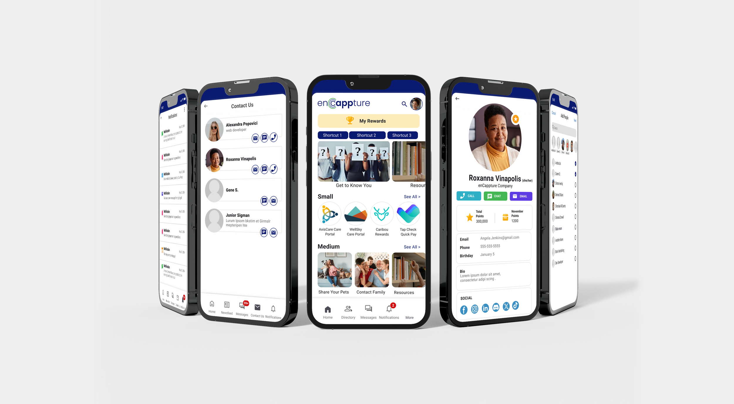
HOME & AFTER APP DESIGN
The redesign process was extensive, requiring a full evaluation of how the app could scale across multiple client verticals. The earlier design lacked consistency and was difficult to reproduce efficiently as a white-label, with slow spin-ups and a challenging UX along the way.
We worked in short design sprints to address priorities surfaced by the Product and Customer Success teams. Using internal feedback and competitive research, we identified friction points, refined visual hierarchy, and iterated on solutions to improve clarity and usability.
I introduced a Figma-based design process to streamline reviews and developer handoffs, and partnered closely with the CEO to translate her vision into a clean, modular product—a flexible foundation for future white-label deployments.
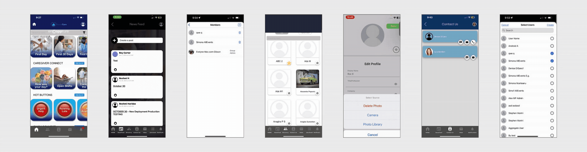
Above: Redesigned home screen (far left) and main menu screens and updated bottom navigation with Newsfeed, Group Chats, Directory, Profile, Contact Us, and more. The original experience was built quickly by multiple teams and lacked visual cohesion. I worked directly with customer stakeholders, the Product Lead, and the CEO using competitive examples and user needs to define a unified visual language and smoother interaction flow.